reading-notes
Aloysious' Codefellows Reading Notes
Code 201 Reading Notes
Class 8
<== Previous Lesson Next Lesson ==>
<== Home 🏠
CSS Layout

960 GRID Generate custom Grids / Selectors
Lorem Ipsum Text Templates
<img src="https://placehold.it/200x300/ddd"/> produces the an image, with a width of 200 pixels, a height, of 300 pixels, and color of #DDD, which is a light gray.
Refresher
A CSS rule-set consists of a selector and a declaration block:

The selector points to the HTML element you want to style.
The declaration block contains one or more declarations separated by semicolons.
Each declaration includes a CSS property name and a value, separated by a colon.
Multiple CSS declarations are separated with semicolons, and declaration blocks are surrounded by curly braces.
There are three ways of inserting a style sheet:
- External CSS
- Internal CSS
- Inline CSS
Cascading Order
All the styles in a page will “cascade” into a new “virtual” style sheet by the following rules, where number one has the highest priority:
- Inline style (inside an HTML element)
- External and internal style sheets (in the head section)
- Browser default
So, an inline style has the highest priority, and will override external and internal styles and browser defaults.
Layout Duckett HTML book (pp.359-404)
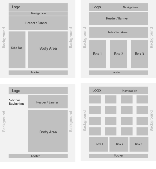
<div>Elements are often used as containing elements to group together sections of a page [can create a grid with them]- Browsr displays the page in a normal flow unless you specify relative, absolute, or fixed positioning.
- The float proprty moves content to the left or right and can be used to create milti column layouts. (Floated layouts require a defined width)
- pages can be fixed width or stretchy layouts
- 960-1000 pixles wide (industry standard)
- Top 60% of the page is reserved for what the site is about (to demonstrate relevance without scrolling)
- Grids helpp create professional and flexible designs
- CSS frameworks provide rules for common tasks.
- You can include multiple CSS files in one page (Helpful for styling each page or setting a baseline for each page like your top banner or logos appearing throughout the site.)
Positioning Schemes
- NORMAL FLOW Boxes in the normal flow belong to a formatting context, which may be block or inline, but not both simultaneously. Block-level boxes participate in a block formatting context. Inline-level boxes participate in an inline formatting context.
- RELATIVE POSITIONING The box’s position is calculated according to the normal flow (this is called the position in normal flow). Then the box is offset relative to its normal position. When a box B is relatively positioned, the position of the following box is calculated as though B were not offset. The effect of ‘position:relative’ on table-row-group, table-header-group, table-footer-group, table-row, table-column-group, table-column, table-cell, and table-caption elements is undefined.
- ABSOLUTE POSITIONING The box’s position (and possibly size) is specified with the ‘top’, ‘right’, ‘bottom’, and ‘left’ properties. These properties specify offsets with respect to the box’s containing block. Absolutely positioned boxes are taken out of the normal flow. This means they have no impact on the layout of later siblings. Also, though absolutely positioned boxes have margins, they do not collapse with any other margins.
- FIXED POSITIONING The box’s position is calculated according to the ‘absolute’ model, but in addition, the box is fixed with respect to some reference. As with the ‘absolute’ model, the box’s margins do not collapse with any other margins. In the case of handheld, projection, screen, tty, and tv media types, the box is fixed with respect to the viewport and does not move when scrolled. In the case of the print media type, the box is rendered on every page, and is fixed with respect to the page box, even if the page is seen through a viewport (in the case of a print-preview, for example). For other media types, the presentation is undefined. Authors may wish to specify ‘fixed’ in a media-dependent way. For instance, an author may want a box to remain at the top of the viewport on the screen, but not at the top of each printed page. The two specifications may be separated by using an @media rule, as in:
- STATIC The box is a normal box, laid out according to the normal flow. The ‘top’, ‘right’, ‘bottom’, and ‘left’ properties do not apply.
- FLOATING ELEMENTS The float CSS property places an element on the left or right side of its container, allowing text and inline elements to wrap around it. The element is removed from the normal flow of the page, though still remaining a part of the flow (in contrast to absolute positioning).
Visual formatting model W3 Schools
SELECTORS W3 Schools
PROPERTIES W3 Schools
Reading
From the Duckett HTML book:
- Chapter 15: “Layout” (pp.359-404)
<== Previous Lesson Next Lesson ==>
<== Home 🏠